Fort Paradox Backstage, part 08: Building Bridges
Published Tuesday 10 January 2012 · Accompanied Episode 092
Welcome back! Today seems to be Tuesday the 10th of January, which means it's time to resume posting, and we're beginning with another Backstage thingummy just like we said we would. Specifically: Fort Paradox Backstage: Designing and Building the Bridge.
I can't remember when we worked out that Fort Paradox was a ship. In my earliest concepts, the setting was going to be a huge building rather than a spacecraft. But once we'd decided it was a starship, it seemed logical that there would be a bridge. Ships have bridges, after all. And of course, the cast would end up on the bridge sooner or later, so we'd need to figure out what it'd look like. Turned out it was sooner.
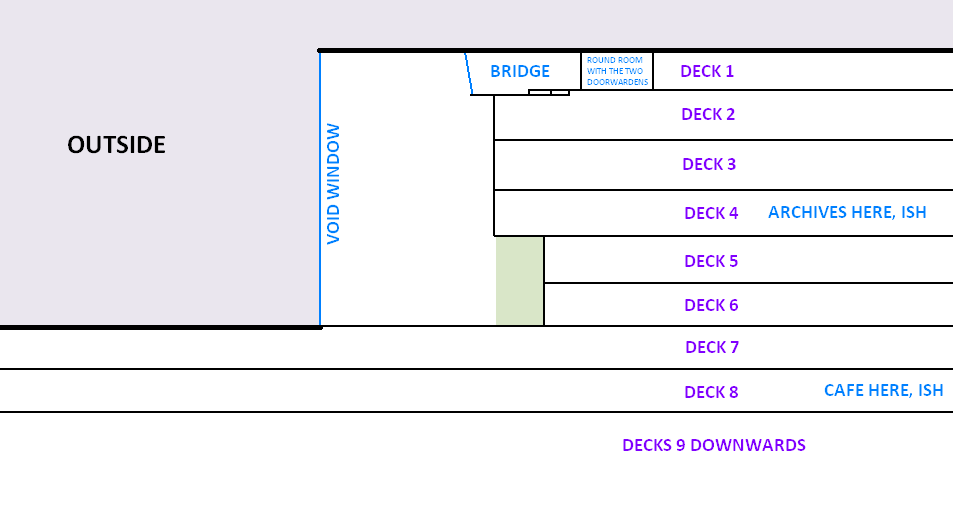
I'll admit up front that my notion of 'Ship's Bridge' has been influenced far more by Star Trek than it has by actual ships, and although the layout of FP's control room isn't quite a clone of the Enterprise's, it does have a lot of subconscious influences from its televised predecessor. Perhaps the most important difference is that FP's bridge, instead of a viewscreen, has an actual window across the front. Two, in fact - the concept is that the Fort's deck numbering starts from 1 (the bridge, and a few other executive rooms) at the top, and then the numbers increase as you move downwards. Yes, that's backwards compared to what we're used to in planetside buildings, but it has a narrative advantage in that we don't need to specify how many decks the Fort has, which means we could (in theory) keep going down and down for hundreds or even thousands of decks if we decided we wanted to. The Void Window is six decks tall, beginning at 1 and extending down to 6 (where the viewing floor is located), and the bridge has two layers of window: one separating the bridge from the upper reaches of the viewing floor, and then beyond that the Void Window itself separating the interior of the Fort from the cold nothingness of space. Probably simpler to explain with a diagram:

The structural relationship between bridge, Void Window, and a couple of other bits, in side profile
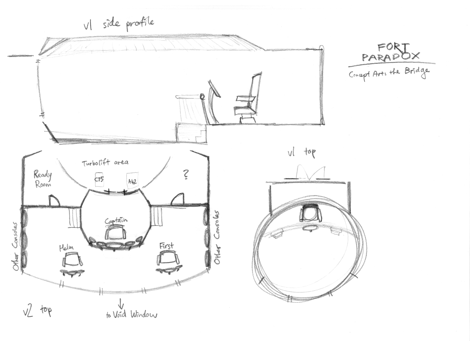
The bridge layout itself didn't work out very well on my first attempt. I felt that the round geometry felt too forced, especially the odd crescent shape of the 'dais' area at the back. The second version gelled much better with the overall feel of the ship so far, was going to be much easier to draw, and had the added bonus that it gave me space to fit in a ready room.

Concept sketches for the bridge
You might like to cross-reference the Version 2 sketch (lower left) with the bridge as it appears in the later part of Chapter III (see Episodes 32 to 38) and in Chapter VIII (Episodes 79 to 84). The double door in 32 is the same one seen (from the other side) in 38, 79 and 84. In fact, in 84, the door is open and you can see a little bit of the round Doorwarden room for the first time since 32. See, the webcomic's geography and stuff does add up!
...okay, there might also be a viewscreen as well as the windows. But we haven't quite made our minds up, and if it does exist then it's never been visible in any of the 'camera angles' we've drawn yet. We'll get back to you on that one if there's ever any more news.
© MGHC & TMJ & SRJ 2010-2024 - all rights reserved